
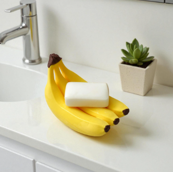
A pale green ceramic soap dish can disappear against a white background even when its shape deserves attention. For a proposed small-shop image project, I would start with one simple product: an oval dish with shallow drainage ridges and a slightly uneven handmade rim. The task is to develop a bathroom setting that makes its character visible without inventing a more luxurious product than the shop actually sells.
The background is where nano banana 3 enters this brief. As an AI image generator and editor, it supports creating a scene from a written prompt or refining an existing image with natural-language instructions. My interest here is the relationship between the ceramic object, its supporting surface, and the light. The final result would be a still concept image, reviewed against the real product before any commercial use.
Let the actual object set the limits
I would begin with a clear photograph of the dish, taken with permission and without unrelated objects covering its edges. The reference should show the rim, ridges, glaze colour, and relative proportions. An image where half the dish disappears behind soap would be a poor starting point, because the hidden details are exactly the ones I need to preserve.
Alongside that photograph, I would keep a short description of the actual object. In this hypothetical brief, the glaze is pale green rather than turquoise, the finish is softly reflective rather than metallic, and the rim is gently irregular. Those distinctions matter more than decorative flourishes in the room. A beautiful image of a different dish would not solve the shop’s visual problem.
The first setting would contain a light stone counter, a folded cream hand towel, and a softly blurred wall. I would leave the soap out initially. Its shape, packaging, and colour would introduce another set of decisions before the dish itself had a convincing place in the frame. Keeping the scene sparse also makes unwanted changes easier to notice.
A counter, a window, and enough breathing space
My first editing brief for nano banana 3 would ask: “Place the referenced pale green ceramic soap dish on a light stone bathroom counter beside a softly folded cream towel. Preserve the dish’s oval proportions, uneven rim, shallow ridges, and glaze colour. Soft window light from the left, subtle natural shadows, quiet neutral wall, no lettering, no additional products.”
The words about preservation describe the intended result, not a guarantee. I would compare the output with the original photograph carefully. A ridge that becomes deeper, a rim that turns perfectly uniform, or an unexpected decorative pattern could change the apparent product. If the dish cannot be represented accurately, the image should remain an internal styling concept rather than become a listing photograph.
The camera angle would sit slightly above counter height, allowing the viewer to see the inside of the dish and its front edge. A very low angle might hide the drainage ridges. A steep overhead view could flatten the rim and make the object feel like a graphic shape. This modest viewpoint would offer a better balance for the particular details the shop needs to communicate.
Revise the shadow before adding decoration
Imagine that the first draft shows the dish hovering a little above the counter. The problem is not a missing plant or an empty wall; it is the contact between the object and its surface. An edit in nano banana 3 could request a softer, closer contact shadow beneath the dish while retaining the direction of the window light and the existing arrangement.
After the edit, I would inspect both the shadow and the ceramic edges. A stronger shadow can sometimes make an object look heavier than intended, while a dark outline may suggest a raised base that the product does not have. The desired change is specific: the dish should appear to rest naturally on the stone, with a plausible transition from light to shade.
If the towel then becomes too prominent, I would move it farther into the background or reduce the contrast of its folds. A supporting prop should give the scene context. It should not become the first thing a shopper notices. In this image, the towel’s job is to suggest a practical bathroom setting and provide a gentle colour contrast with the green glaze.
Try a second surface without changing the product
A warm timber surface could be an alternative to pale stone. I would ask nano banana 3 for a separate version with a restrained wood grain, keeping the dish’s shape and colour as close to the reference as possible. This comparison would help explore whether the ceramic feels clearer against a warmer material, without claiming either setting already exists in the shop.
The two versions would need comparable framing. If one image places the dish much closer to the camera, the apparent improvement might come from scale rather than the surface choice. I would evaluate the rim, the green glaze, and the space around the object at the same display size, then select the setting that makes those details easiest to understand.
At this stage, adding a plain bar of soap could be useful, provided it does not cover most of the dish. I would avoid branded packaging or an oversized bar that makes the ceramic look smaller than it is. Any prop suggesting a particular product size would need comparison with real dimensions before the picture could be presented as a practical buying reference.
See also: Feline Kidney Disease Life Expectancy: Factors, Treatments, and Longevity Strategies
Prepare the image for the place it will appear
The nano banana 3 concept might eventually sit in a square collection tile, while a wider version supports a shop announcement. Those layouts need separate attention. A square crop could keep the dish near the centre, with the towel forming a soft diagonal behind it. The wider composition could leave quiet space for a heading without squeezing the product against an edge.
I would add the shop’s actual wording, price, and product name in a design editor. Keeping that information separate from the generated scene makes later corrections straightforward. It also avoids allowing a decorative label or invented inscription to become part of the product image. The ceramic should remain recognisable when the text layer is hidden.
My final check would return to the original photograph rather than to the most attractive draft. Has the glaze shifted? Are the ridges still the same? Does the dish appear thicker or wider than it really is? The useful contribution of nano banana 3 is the ability to explore a setting and refine an image; the decision to publish depends on whether that image represents the object honestly. For this brief, a calm, accurate composition is a stronger result than a spectacular bathroom scene.


